React UI Libraries 2025: Styled vs Utility vs Headless
The React ecosystem has evolved dramatically, and choosing the right UI library approach in 2025 can make or break your project's success. Three distinct philosophies dominate the landscape: traditional styled component libraries, utility-first frameworks, and headless solutions. Each approach offers unique advantages and trade-offs that developers must carefully consider.
The decision between Material UI's polished components, Tailwind CSS's utility classes, or Radix UI's unstyled primitives isn't just about personal preference. It impacts everything from development speed and bundle size to long-term maintainability and design flexibility. Understanding these trade-offs becomes crucial as teams face increasing pressure to ship faster while maintaining high-quality user experiences.
Link to section: The Three Dominant ApproachesThe Three Dominant Approaches
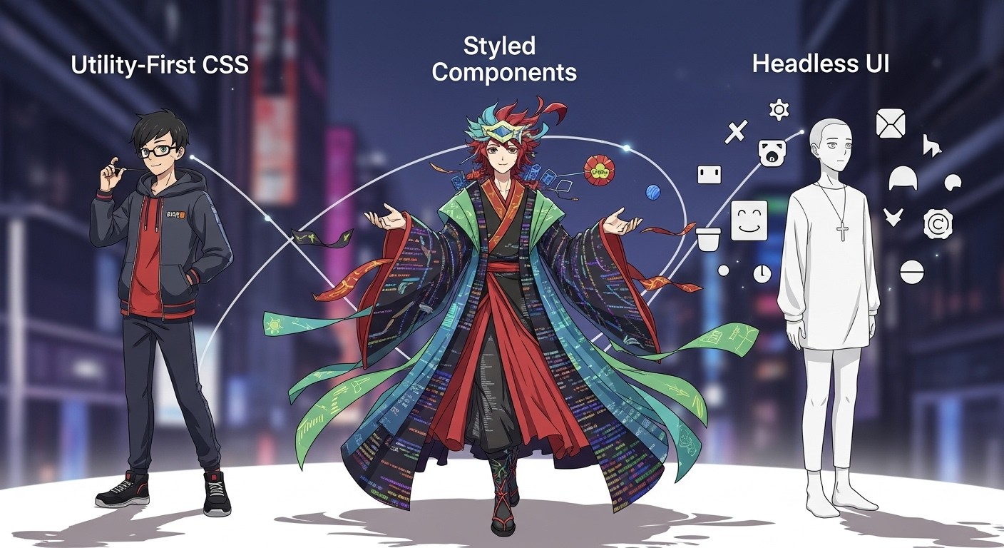
The React UI library ecosystem has crystallized around three primary methodologies, each serving different project needs and team dynamics. Traditional styled libraries provide complete, designed components ready for immediate use. Utility-first frameworks offer granular control through atomic CSS classes. Headless libraries deliver functionality without visual opinions, leaving styling decisions entirely to developers.
This fragmentation reflects the maturation of React development practices and the diverse requirements of modern web applications. Enterprise applications often favor comprehensive solutions, while design-heavy projects gravitate toward maximum customization flexibility. Performance-critical applications might choose the lightest possible approach.
The choice between these approaches often determines not just the initial development experience, but also the long-term evolution of a project's design system and maintenance burden.
Link to section: Traditional Styled Component LibrariesTraditional Styled Component Libraries
Link to section: Material UI: The Enterprise HeavyweightMaterial UI: The Enterprise Heavyweight
Material UI remains the most widely adopted React component library, with over 88,000 GitHub stars and 1.3 million weekly downloads. Built on Google's Material Design principles, it provides a comprehensive suite of pre-styled components that work immediately out of the box. The library excels in enterprise environments where consistent, professional aesthetics matter more than unique design expression.
Material UI's strength lies in its completeness. Developers get everything from basic buttons to complex data tables, all following established design patterns. The theming system allows customization while maintaining visual coherence, and the extensive documentation reduces learning curves for new team members. TypeScript support is excellent, providing robust type safety across all components.
However, this comprehensiveness comes with costs. Bundle sizes can be substantial, even with tree shaking. Achieving truly custom designs often requires fighting against the library's opinionated styles, leading to CSS specificity battles and increased complexity. Performance optimization becomes crucial for applications that don't fully utilize Material Design aesthetics.
Link to section: Chakra UI: The Developer-Friendly AlternativeChakra UI: The Developer-Friendly Alternative
Chakra UI has gained significant traction as a more flexible alternative to Material UI. Built with accessibility and developer experience as primary concerns, it offers a composable component system that feels more natural to many React developers. The API design emphasizes consistency and predictability, making it easier to learn and use effectively.
The library's responsive design approach stands out, using object and array syntax for breakpoint-specific styling. This system feels more intuitive than traditional CSS media queries and integrates seamlessly with the component-based architecture. Chakra UI's focus on accessibility means WCAG compliance comes standard, reducing the burden on development teams to implement these features manually.
Chakra UI strikes a balance between opinionated design and customization flexibility. While it provides attractive defaults, overriding styles feels less combative than with heavier libraries. The community has embraced this balance, contributing to a rich ecosystem of extensions and patterns.
Link to section: Ant Design: The Enterprise WorkhorseAnt Design: The Enterprise Workhorse
Ant Design targets enterprise applications with its comprehensive component collection and professional aesthetic. Originating from Chinese design principles, it offers a distinct visual language that differs from Western-influenced libraries. The component set includes sophisticated elements like organization charts, complex form layouts, and data visualization tools.
The library's internationalization support is exceptional, with built-in support for dozens of languages and right-to-left text rendering. This makes it particularly valuable for global applications or products serving diverse markets. The design system's coherence across complex interfaces helps maintain usability even in data-heavy applications.
Ant Design's enterprise focus shows in its attention to business application needs. Features like advanced table sorting, filtering, and pagination come standard. The form handling capabilities are particularly robust, with built-in validation and error handling patterns that streamline common business workflows.
Link to section: Utility-First Framework ApproachUtility-First Framework Approach
Link to section: Tailwind CSS: The Atomic RevolutionTailwind CSS: The Atomic Revolution
Tailwind CSS has fundamentally changed how developers approach styling, promoting utility-first principles that prioritize flexibility and performance. Rather than providing pre-built components, Tailwind offers atomic CSS classes that can be composed to create any design. This approach eliminates unused CSS and gives developers granular control over every visual aspect.
The utility-first philosophy excels in custom design implementation. Designers can translate their vision directly into code without battling against existing component styles. The atomic nature of classes means changes remain localized, reducing the risk of unintended side effects across an application. Performance benefits are substantial when properly configured, as PurgeCSS can eliminate unused styles effectively.
However, the utility-first approach requires more CSS knowledge and can initially feel overwhelming to developers accustomed to component-based styling. HTML markup becomes more verbose, and maintaining consistency across a large team requires discipline and well-established conventions.
Link to section: shadcn/ui: Bridging Utility and Componentsshadcn/ui: Bridging Utility and Components
The combination of Tailwind CSS with shadcn/ui represents an evolution in utility-first development. shadcn/ui provides accessible, well-designed components that use Tailwind classes internally, offering the best of both worlds. Developers get the flexibility of utility-first styling with the convenience of pre-built components.
Unlike traditional component libraries, shadcn/ui components are copied directly into your project rather than imported as dependencies. This approach gives complete ownership and customization control while maintaining the benefits of proven, accessible component patterns. The components serve as starting points that can be modified without library constraints.
The shadcn/ui approach has gained particular traction among developers who want design system consistency without dependency lock-in. The ability to modify components directly means long-term maintenance concerns are reduced, and customization capabilities are unlimited.
Link to section: Tailwind's Ecosystem EvolutionTailwind's Ecosystem Evolution
The Tailwind ecosystem has expanded beyond the core framework to include specialized tools and integrations. Headless UI provides unstyled, accessible components designed specifically for use with Tailwind. Tailwind UI offers pre-designed page templates and component examples that demonstrate best practices.
This ecosystem approach allows developers to adopt utility-first principles incrementally. Teams can start with basic Tailwind styling and gradually incorporate more sophisticated components and patterns as their needs evolve. The learning curve becomes more manageable, and the investment in Tailwind knowledge pays dividends across multiple projects.
The community-driven nature of the Tailwind ecosystem means new patterns and solutions emerge regularly. Popular component collections and templates provide inspiration and starting points for common design challenges.
Link to section: Headless and Unstyled LibrariesHeadless and Unstyled Libraries
Link to section: Radix UI: Functionality Without OpinionsRadix UI: Functionality Without Opinions
Radix UI represents the purest expression of the headless component philosophy. It provides fully accessible, unstyled components that handle complex interaction patterns and state management while leaving all visual decisions to developers. This approach maximizes design flexibility while ensuring robust functionality and accessibility compliance.
The library excels in projects with unique design requirements or established design systems. By separating behavior from appearance, Radix UI enables pixel-perfect implementations of custom designs without compromise. The accessibility features are comprehensive, handling complex patterns like keyboard navigation, ARIA attributes, and screen reader compatibility automatically.
Radix UI's component APIs are thoughtfully designed, providing granular control over behavior while maintaining simplicity. The composition patterns feel natural to React developers, and the documentation clearly explains both usage and underlying accessibility considerations.
Link to section: React Aria: Adobe's Accessibility FocusReact Aria: Adobe's Accessibility Focus
React Aria takes the headless approach even further, providing hooks rather than components. This pattern gives maximum flexibility while ensuring accessibility remains a primary concern. Adobe's investment in the library reflects enterprise-level requirements for internationalization and accessibility compliance.
The hook-based approach allows developers to integrate accessibility features into any component structure. This flexibility proves valuable in complex applications where traditional component boundaries might not align with accessibility requirements. The library handles internationalization concerns like right-to-left text rendering and locale-specific date formatting automatically.
React Aria's learning curve is steeper than component-based alternatives, but the resulting control and accessibility benefits often justify the investment. Teams working on applications with strict accessibility requirements or complex interaction patterns find the flexibility invaluable.
Link to section: The Headless AdvantageThe Headless Advantage
Headless libraries shine in scenarios where design uniqueness is paramount. They eliminate the need to fight against existing styles or override component defaults. The separation of concerns between functionality and appearance makes code more maintainable and testable.
Performance characteristics of headless libraries are typically excellent. Bundle sizes remain minimal since no styling code is included, and runtime performance focuses purely on essential functionality. This makes them attractive for performance-critical applications or mobile-first experiences.
The main challenge with headless libraries is the increased development effort required. Every visual aspect must be implemented from scratch, which can slow initial development. Teams need strong CSS skills and design resources to maximize the benefits of this approach.
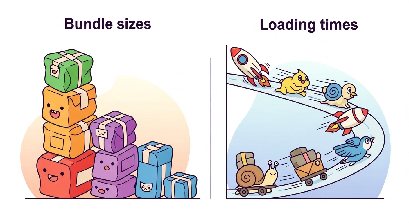
Link to section: Performance and Bundle Size ConsiderationsPerformance and Bundle Size Considerations
Performance characteristics vary dramatically between approaches, with implications for user experience and development efficiency. Traditional styled libraries typically carry larger bundle sizes due to comprehensive component sets and styling systems. Material UI, even with tree shaking, often adds significant weight to applications that don't fully utilize its component ecosystem.
Utility-first approaches like Tailwind CSS can achieve excellent performance characteristics when properly configured. The atomic nature of utility classes means only used styles are included in production builds. However, development builds can be large, and build tooling configuration becomes crucial for optimal results.
Headless libraries offer the best theoretical performance since they include only essential functionality. The styling burden shifts to custom CSS or utility frameworks, allowing fine-tuned control over what code reaches production. This approach requires more sophisticated build processes but can achieve minimal bundle sizes.
Runtime performance considerations extend beyond bundle size. Complex component libraries may include unnecessary JavaScript for unused features. Headless approaches minimize runtime overhead but may require more custom code that impacts performance if not implemented efficiently.
Modern bundling tools and techniques like code splitting, lazy loading, and dynamic imports can mitigate many performance concerns. However, the architectural decisions made during library selection often determine how effectively these optimizations can be applied.
Link to section: Developer Experience and Learning CurvesDeveloper Experience and Learning Curves
The developer experience varies significantly across approaches, affecting team productivity and project timelines. Traditional styled libraries offer the fastest path to functional interfaces, especially for developers with limited CSS expertise. The comprehensive documentation and community resources reduce the learning investment required to achieve professional results.
Material UI and similar libraries excel in enterprise environments where developer onboarding speed matters. New team members can contribute meaningfully to interface development without extensive styling knowledge. The consistency guarantees provided by established design systems reduce the need for detailed design reviews and implementation discussions.
Utility-first approaches require more CSS knowledge but provide greater long-term flexibility. The atomic nature of utilities means developers learn transferable skills rather than library-specific APIs. This knowledge remains valuable across projects and teams, making the initial learning investment worthwhile for many developers.
Headless libraries present the steepest learning curve but offer the most control. Teams must understand both the functional aspects of components and the styling implementation details. This requirement makes headless approaches most suitable for experienced teams with strong design and CSS capabilities.
Debugging and maintenance experiences differ markedly between approaches. Traditional component libraries can be opaque when issues arise, requiring deep understanding of library internals. Utility-first approaches make styling issues more transparent but can create verbosity that complicates debugging. Headless libraries provide complete visibility but require teams to handle all aspects of implementation.
Link to section: When to Choose Each ApproachWhen to Choose Each Approach
Link to section: Traditional Styled Libraries Are Best For:Traditional Styled Libraries Are Best For:
Enterprise applications requiring consistent, professional aesthetics benefit most from traditional styled libraries. Teams with limited design resources or tight deadlines can leverage the pre-built components to achieve polished results quickly. Projects that align well with Material Design or similar established design systems can maximize the value of these comprehensive libraries.
Large teams with varying skill levels often find traditional libraries provide the best balance of productivity and consistency. The opinionated nature of these libraries reduces the number of design decisions required and helps maintain coherence across different developers' contributions.
Applications requiring extensive internationalization support or complex accessibility features benefit from the mature implementations provided by established libraries. The comprehensive testing and community validation of these features would be difficult and expensive to replicate in custom implementations.
Link to section: Utility-First Approaches Excel When:Utility-First Approaches Excel When:
Custom design implementation is a priority, and teams want to avoid fighting against existing component styles. Projects with unique branding requirements or innovative interface patterns benefit from the flexibility utility-first approaches provide. The atomic nature of utility classes makes implementing designer vision straightforward and maintainable.
Performance optimization is crucial, and teams can invest in proper build configuration to achieve minimal bundle sizes. Applications targeting mobile users or performance-sensitive environments can benefit from the granular control utility-first approaches offer over included styles.
Teams want to build their own design system or component library can use utility-first approaches as a foundation. The flexibility and performance characteristics make them excellent building blocks for custom component implementations. The knowledge investment pays dividends across multiple projects when teams establish their own patterns and conventions.
Link to section: Headless Libraries Are Ideal For:Headless Libraries Are Ideal For:
Projects with strict accessibility requirements or complex interaction patterns benefit from the robust implementations headless libraries provide. Teams working on applications for users with disabilities or in regulated industries often find the comprehensive accessibility features justify the additional development effort.
Highly customized interfaces that don't align with standard design patterns require the flexibility headless libraries offer. Creative agencies, marketing websites, or applications with unique interaction paradigms can implement their vision without compromise.
Teams with strong CSS and design capabilities who want maximum control over their implementation details. The separation of functionality from appearance allows experienced teams to optimize both aspects independently and achieve exactly the results they envision.
Link to section: Integration with Modern Development PracticesIntegration with Modern Development Practices
The choice of UI library approach increasingly impacts how teams integrate with broader development practices and tooling. Design system management, continuous integration workflows, and collaborative processes all vary depending on the architectural decisions made during library selection.
Modern design system approaches must account for the library choice when establishing design token workflows and component governance. Traditional libraries may conflict with custom design tokens, while headless approaches require more sophisticated tooling to maintain design consistency.
Version control and code review processes differ significantly between approaches. Utility-first implementations create more verbose diffs but clearer change visibility. Traditional component libraries hide styling changes within version updates, making review more challenging. Headless approaches provide complete transparency but require reviewers to understand both functional and styling implications.
Automated testing strategies must align with library architecture. Traditional components often come with established testing patterns, while utility-first and headless approaches require more custom testing implementation. The level of testing complexity varies with the amount of custom code required by each approach.
Link to section: Future Trends and EvolutionFuture Trends and Evolution
The React UI library ecosystem continues evolving as new patterns and technologies emerge. Artificial intelligence integration is becoming more prevalent, with tools offering automated component generation and styling suggestions. Traditional libraries are incorporating AI-powered theming and customization features, while utility-first approaches are exploring intelligent class suggestions.
Server-side rendering and React Server Components are pushing library architectures in new directions. Libraries must balance client-side interactivity with server-first rendering requirements. This trend may favor approaches with smaller client-side footprints and better server compatibility.
Component composition patterns are becoming more sophisticated, with libraries exploring new ways to balance reusability with customization. The boundaries between traditional, utility-first, and headless approaches may blur as hybrid solutions emerge.
Performance optimization techniques like automatic code splitting and selective hydration are becoming standard expectations. Libraries that can seamlessly integrate with these advanced optimization strategies will likely gain adoption advantages.
The growing focus on accessibility and internationalization is raising the baseline requirements for all UI libraries. Teams can no longer treat these features as optional, making the robust implementations provided by mature libraries increasingly valuable.
Link to section: Making the Right Choice for Your ProjectMaking the Right Choice for Your Project
Selecting the optimal UI library approach requires careful consideration of project constraints, team capabilities, and long-term maintenance requirements. No single approach dominates all scenarios, and the best choice depends on specific circumstances and priorities.
Teams should evaluate their design requirements, performance constraints, and development timeline when making this decision. Projects with tight deadlines and standard interface requirements may benefit from traditional styled libraries, while those prioritizing unique design or performance optimization might prefer alternative approaches.
The skill composition of the development team plays a crucial role in library selection. Teams with strong CSS and design capabilities can maximize the benefits of utility-first or headless approaches, while those with limited styling expertise may achieve better results with traditional component libraries.
Long-term maintenance considerations often prove more important than initial development speed. Projects expecting significant design evolution or customization may benefit from approaches that provide greater flexibility, even if the initial development effort is higher.
The React UI library landscape in 2025 offers mature solutions for every development scenario. Understanding the trade-offs between traditional styled libraries, utility-first frameworks, and headless approaches enables teams to make informed decisions that align with their specific needs and constraints. Success comes from matching library philosophy with project requirements rather than following trends or popular opinion.
Each approach has earned its place in the ecosystem by solving different problems effectively. The key is recognizing which problems your project faces and selecting the approach that addresses them most efficiently while supporting your team's capabilities and long-term goals.